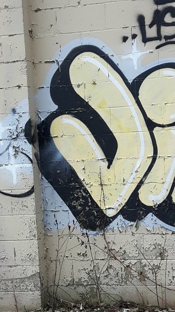
graffiti styled "j"
|
This picture captures the letter 'J' in a graffiti art style on an old worn out wall. The saturation was decreased to have a more of a worn out tone. The brightness was increased in order for the letter to be seen better. The contrast was decreased only a little bit, to have a more grim look. Some of the wall, as well as the rest of the graffiti word were cropped out to focus on the 'J' more. |
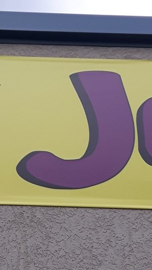
Cartoon styled "j"
|
In this photo, the letter 'J' in a cartoon like font. The contrast was increased a little bit for the purple to pop out against the yellow in the dim lighting even more than before. the saturation was decreased in order for the photo to look less cartoon like. |
|
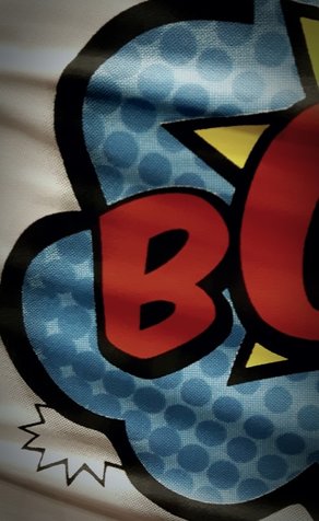
COMIC STYLED "B"
|
This photo capture the letter "B" in a comic book like format. The contrast was increased, making the blue dots pop out against the other shade of blue. The saturation was increased for the red to appear more vibrant. The saturated red makes it the main focus. The brightness was decreased because the picture was taken in a lighter room, which made the colors more washed out. The shadows were increased which makes the shadows more noticeable. |
